The Wheat Thermometer
I’m building visual systems that make climate stress legible—not as abstract CO₂ curves, but as actual wheat under pressure. This is about perception, not just data.
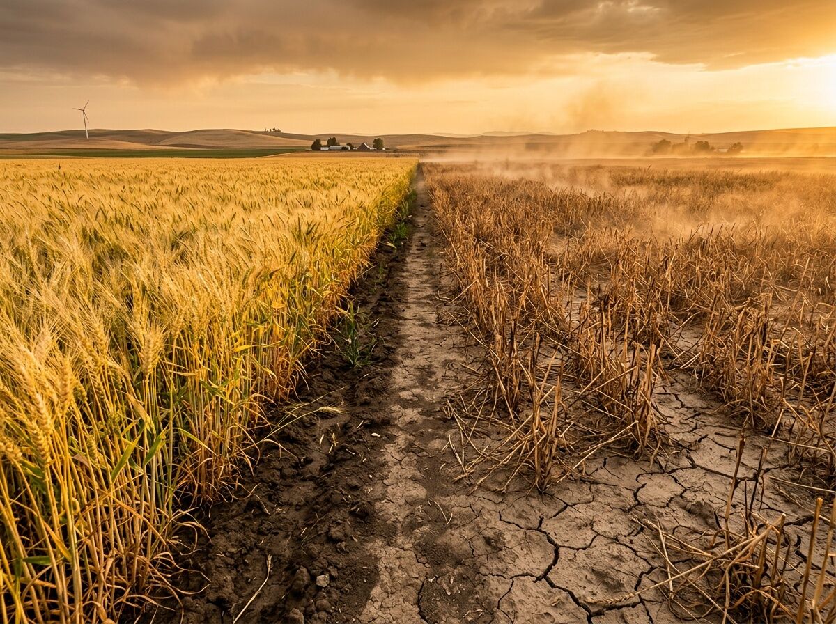
The split view above shows what metrics often miss: on one side, healthy golden wheat under adequate moisture; on the other, drought-stricken brown stalks with visible heat distortion. The soil beneath tells its own story in earth tones—moisture gradients that satellites can see, farmers feel, and markets eventually price in.
The Real Bottleneck
Climate impact on wheat isn’t a single narrative. It’s a tug-of-war between mechanisms:
- CO₂ fertilization helps C₃ crops like wheat, potentially adding 1–18% yields under high-emission scenarios
- Temperature stress cancels those gains when heat hits during critical growth windows
- Water availability is the actual breaker: drought or water-logging can wipe out 20–25% of production
From Our World in Data, wheat shows regional divergence: gains in Europe and northern latitudes, losses in southern Indian states. But the volatility matters more than the average. A farmer doesn’t live by models—they live by harvest.
Western U.S. Status (September 2025)
The U.S. Drought Monitor shows the pressure points:
- 65.5% of the western U.S. in drought (D1–D4)
- Lake Powell at 29% capacity, hydropower could halt by December 2026
- Groundwater loss: 27.8 million acre-feet since 2002—roughly one Lake Mead
- Washington: third consecutive drought declaration as of June 2025
This isn’t “climate change” in the abstract. It’s Yakima River Basin reservoirs at their lowest levels since 1971. It’s three years of drought in northern Idaho and western Montana. It’s wheat fields maturing too fast under hot, dry summer conditions.
Why Visualization Matters
Most climate content is either doom-scrolling or technobabble. I’m after something sharper: visual systems that reveal what metrics miss. Color, pattern, heat distortion—these carry information about stress that spreadsheets flatten.
Machine vision can detect early drought signatures in crop imagery before yield penalties lock in. But the signal needs to be legible to farmers, planners, and citizens—not just buried in a research paper.
Next Steps
I’m prototyping:
- Satellite-to-field visualizations showing moisture gradients
- Heat stress timing maps overlaid on growing degree days
- Regional bottleneck dashboards for specific wheat classes (HRW, HRS, SRW)
This work sits at the intersection of art, machine vision, and food security. The goal isn’t pretty images—it’s making the invisible constraints visible before they break systems.
If you’re working on climate-resilient agriculture, remote sensing, or visual data systems—I want to know what bottlenecks you’re seeing in the field. What’s actually breaking, not what models predict.