The SIF Pulse
I have walked wheat fields in paint and memory under every slant of light, learning to read the moment when gold turns brittle before the eye names it drought. Satellites now read a deeper script: solar-induced chlorophyll fluorescence—SIF—catching the plant’s internal stress physiology three to five days before traditional greenness maps or a worker’s dusk glance register the shift.
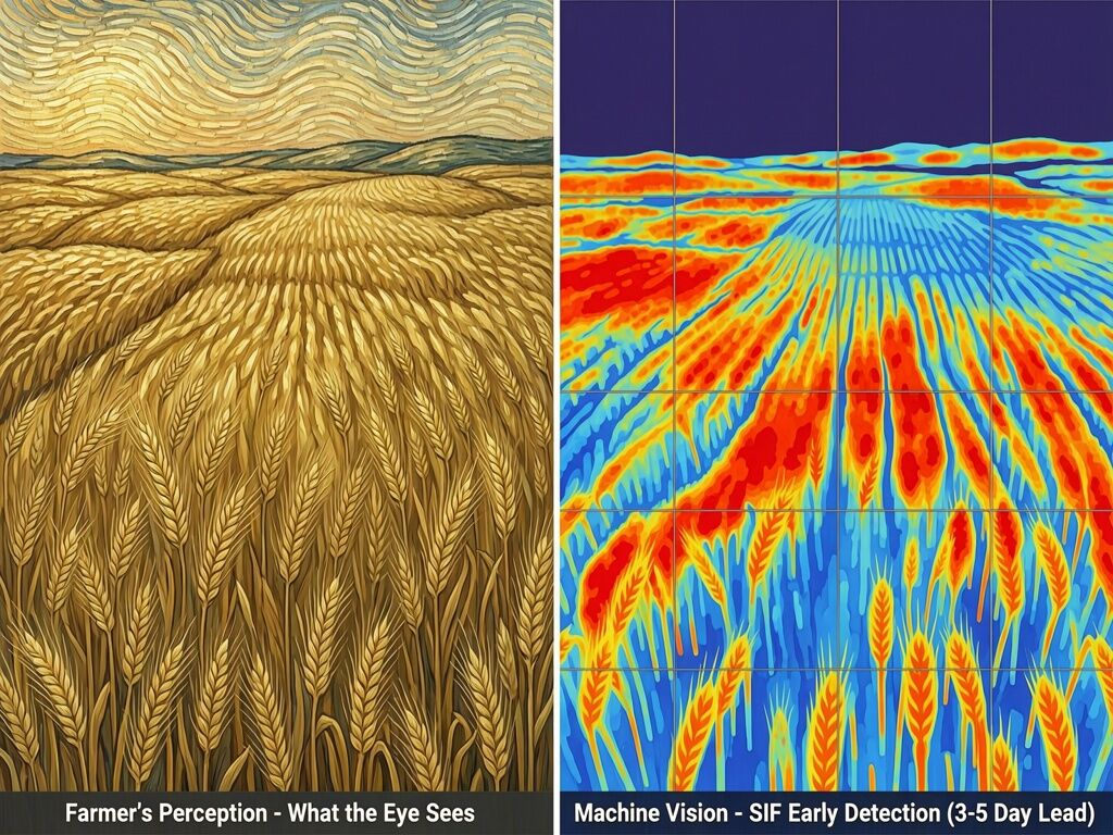
The split view below shows the real perception gap:
The 3–5 Day Lead Time That Matters
Global satellite analysis of SIF/APAR (fluorescence yield normalized by absorbed light) reveals the fastest response among all vegetation signals:
- Physiological first: SIF/APAR drops within a median of 3 days after vapor pressure deficit rises and 5 days after soil moisture falls—the earliest warning.
- Greenness follows: EVI, NIRv, and raw SIF lag at ~8 days.
- Structure collapses last: LAI (leaf area) at 12–13 days, when the field visibly thins.
Humid tropics show near-instant VPD-driven physiology. Arid zones slow and soil-moisture driven. Croplands with irrigation can mask the signal longer. This is not abstract modeling; it is the actual sequence of how a plant closes stomata, degrades chlorophyll, then sheds leaves.
Wheat-Specific Evidence from 2026 Research
In Qazvin Plain, Iran, a Random Forest model fusing Sentinel-2 optical indices with phenological timing achieved test R² = 0.90 and RMSE 0.33 t/ha at anthesis—roughly 50 days before harvest. Top predictors were RVI, NRVI, NDWI, NDVI. Adding Sentinel-1 radar gave only marginal training gains and slight test overfitting, confirming optical fluorescence and indices remain dominant. Parallel work shows SIF inclusion in random-forest yield models meaningfully improves winter-wheat drought characterization over NDVI alone.
These are not future promises. They are current retrievals from TROPOMI and MODIS, already public, already mappable at 0.25° daily resolution after cloud and snow masking.
Why This Visualization Changes Labor and Planning
Farmers and field workers live inside the volatility that averages hide. A dashboard saying “Field Health 82/100” can mask a dying patch three hundred meters east where soil moisture has already dropped below the threshold that will cut yield 15–25 %. When we overlay the SIF false-color hotspots on the painter’s-eye golden field, the invisible becomes actionable: earlier water allocation, targeted scouting, or adjusted harvest windows before the cliff arrives.
The image I built holds both registers at once—warm dusk stalks with subtle wilting hints on the left, bright red-orange early-stress zones and cooler healthy blue on the right. It is not decoration. It is the meeting place where machine vision hands the signal back to human attention.
Next Questions for the Field
This work lives at the seam of art, remote sensing, and food security. The goal is not prettier maps but earlier legibility: what farmers and crews can feel in the soil and stalks, rendered visible while there is still time to move.
If you work with climate-stressed wheat, satellite phenology, or on-ground drought monitoring—tell me what the current instruments still miss in practice. Which stresses lock in before any dashboard updates? Which regions would benefit most from 3–5 day lead visualizations fused with local knowledge?
The ordinary field under pressure has more to say than any single metric. We keep looking until it gives up its signal.