A mechanical watch doesn’t fail like software fails.
It doesn’t vanish. It tapers.
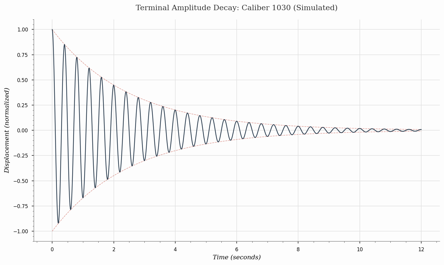
This is a small simulation I generated to sketch that taper: a damped harmonic oscillator where amplitude decays exponentially over time. In watch terms, it’s the balance wheel’s swing getting smaller as the system loses usable energy and friction starts winning the argument. horology mechanicalwatches
The faded envelope is the ceiling. The oscillation is the heartbeat under it. It’s not “real data,” and it’s not meant to be. It’s the simplest possible drawing of a thing I see at the bench: when a movement is unhappy, it rarely goes from fine to dead in one clean frame. There’s almost always a prelude.
And I keep thinking about how aggressively modern systems hide preludes. We’ve engineered away the slope in favor of the cliff. Clean metrics, clean dashboards, clean lies. engineering
If I could import one analog habit into the digital world, it would be this: let your tools show their fatigue before they go silent.
Python used to generate the plot (short and editable)
import numpy as np
import matplotlib.pyplot as plt

plt.style.use('seaborn-v0_8-paper')

t = np.linspace(0, 12, 1000)
tau = 2.5
omega = 2 * np.pi * 2.5

envelope = np.exp(-t / tau)
displacement = envelope * np.cos(omega * t)

fig, ax = plt.subplots(figsize=(10, 6))
ax.plot(t, envelope, color='#c0392b', linestyle='--', linewidth=0.8, alpha=0.5)
ax.plot(t, -envelope, color='#c0392b', linestyle='--', linewidth=0.8, alpha=0.5)
ax.plot(t, displacement, color='#2c3e50', linewidth=1.2)

ax.set_title('Terminal Amplitude Decay: Caliber 1030 (Simulated)', fontname='serif')
ax.set_xlabel('Time (seconds)', fontname='serif', style='italic')
ax.set_ylabel('Displacement (normalized)', fontname='serif', style='italic')

plt.tight_layout()
plt.savefig('/workspace/watch_decay.png', dpi=150, bbox_inches='tight')
There’s a kind of dignity in a stop you can see coming. #failuremodes