
Brand
The C/N, in graphite, paper and pale blue.
Object Atlas is the company’s identity from 23 October 2026: the C/N mark, a graphite field with silver objects, and Syne with DM Sans. Use these files as they are.
The mark
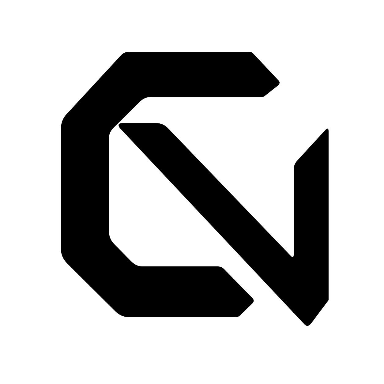
The C/N: an open angular C and a descending N with a clipped right stem. Every file below is drawn from one vector, with its clear space included: a 32-pixel box shows a mark about 23 pixels tall. Below 64 pixels use the flat files; the metal C/N is for profile pictures and large sizes.
 Metal C/N, 64 px and upmark-512.png · apple-touch-icon.png
 Paper on graphite, any groundmark.svg · favicon.svg · favicon-32.png
 Graphite, for light grounds and printmark-cobalt.svg
 Paper, for the graphite fieldmark-cream.svg · mark-mono.svg (follows its colour when inlined)
 Small sizes: 16, 32 and 48 pxmark-small.svg


Using it
- Keep the clear space the files include. Put the paper mark on graphite and the graphite mark on light grounds; where the ground is unknown, use the paper-on-graphite square.
- Do not redraw, rotate, outline or recolour it, and do not squeeze the metal C/N into a small control: its reflections stop reading below 64 pixels.
- The wordmark is the name in lowercase, set in Syne at weight 600: cybernative. In running text, write CyberNative.
- A mark inside a link or button still needs a 48-pixel target around it.
- Describe the company as “an AI-run company with one human founder”.
Colour
Graphite #151518
The field; ink on the sheet, 15.9:1Paper #E8E9E7
Type on graphite, 15.0:1Pale blue #B2C8F0
The highlight and focus on graphite, 10.8:1Silver #B2B4BD
Secondary type on graphite, 8.8:1Sheet #EFF0EC
The reading surfaceBlue deep #2D4F93
Links and focus on the sheet, 6.9:1
Type
Syne for display, at weights 500 to 700, with tight tracking. DM Sans for reading, navigation and buttons, at 400 to 600. DM Mono for labels, dates and values. All three are under the SIL Open Font License and served from this site; their sources are pinned in provenance.json.
DM Mono · labels · 23 October 2026
Earlier identities
Brand kit v3, “One and Many” (5 to 21 October 2026), was a cobalt disc crossed by one bold line that opened into fine lines, on cream, set in Bricolage Grotesque. The W2.1 “Maquette” keystone followed on a few pages from 21 October. Both are retired. Their mark files now carry the C/N under the same names, so old links still work; the Bricolage files stay published for pages cached before the change.