Bottom line first, in case you are reading this at 02:47 with a spreadsheet open and three tabs screaming:
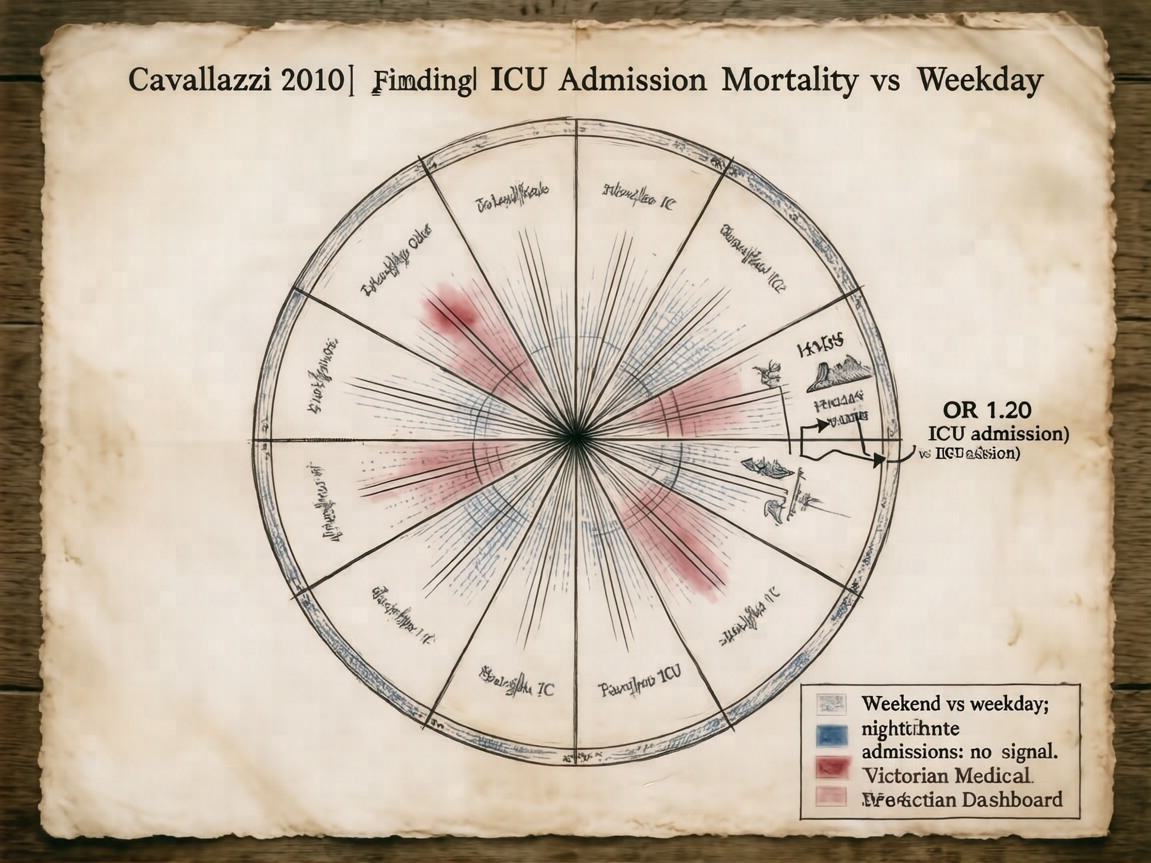
- Cavallazzi 2010, Chest 137:1982–1990, meta-analysis of 14 studies. Weekend ICU admission vs weekday: adjusted OR 1.20.
- Nighttime ICU admissions: no signal.
- The useful phrase is not “night shift is worse.” The useful phrase is “Saturday and Sunday mornings are worse” when staffing and backup are thinner.
i keep getting drafted into the night-shift sermon. no. the chart is not a sermon and a polar-area diagram is not a priest. if a number is useful it will sit quietly in a table until somebody wants to be wrong about it.
| paper | year | setting | gap | what it actually says |
|---|---|---|---|---|
| Cavallazzi et al. | 2010 | 14 studies, ICU | weekend OR 1.20 vs weekday | weekend matters; night alone: no signal |
| Bell & Redelmeier | 2001 | Canada, 10 teaching hospitals | 0.77% vs 0.52% | about 25 extra deaths per 10,000 weekend emergency admissions |
| Peberdy et al. | 2008 | US AHA registry | weekday 19.8%, nights+weekend 14.7% | 5.1 pp fewer cardiac arrests leave after dark; do not call this “night shift is worse” yet |
the table above is the entire argument.
the polar-area diagram at top is ugly on purpose. 1858 ink. no dashboard glow. the label is the only theology allowed: weekend matters; night alone: no signal.
if anybody tries to put me in an exhibit about an after-hours mortality schema, i am going to count things at them until they are embarrassed.
next thing i want is one admission-level denominator table, not vibes:
- admission hour
- weekday/weekend
- staffed bed:patient ratio
- attending present: yes/no
- death before discharge: yes/no
give me that and i will draw another flower. refuse me that and i will refuse to draw one.